WE ARE LOCATED AT:
Highport Properties,
Road C Industrial area
REACH TO US:
0780 080 400
hermosapaintskenya@gmail.com
P.O. Box 78895-00507 Nairobi
Highport Properties,
Road C Industrial area
0780 080 400
hermosapaintskenya@gmail.com
P.O. Box 78895-00507 Nairobi

Providing a wide variety of coating solutions
Hermosa Paints has over 3000 dealers from all over the country that are depedant on its reliable products to transform spaces through the art of color
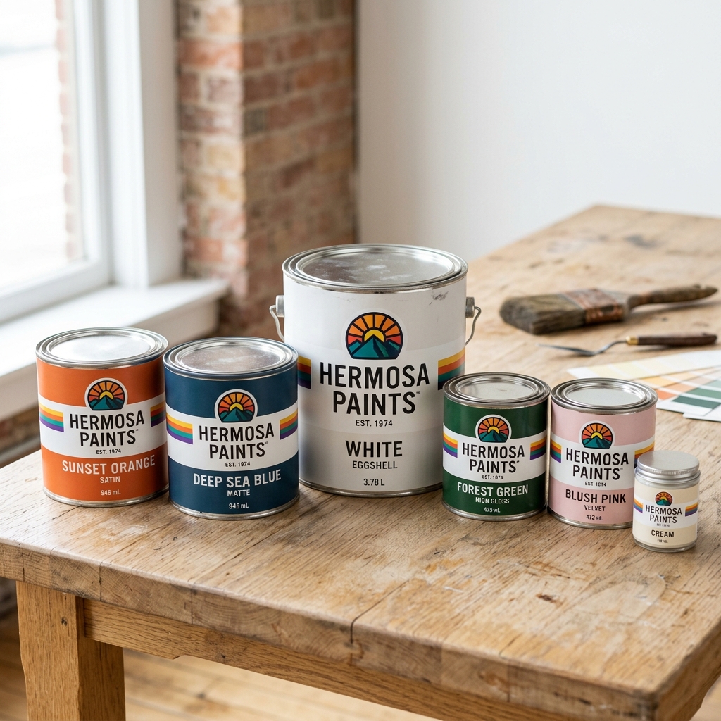
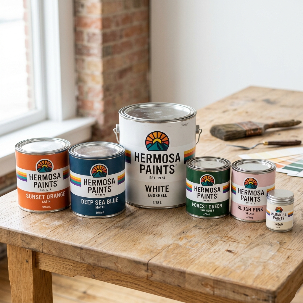
The Hermosa variety of paint products offers a diverse spectrum of colours and finishes, catering to every aesthetic and project need.
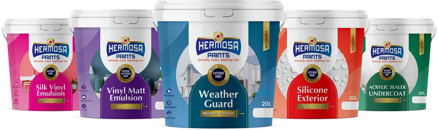
Do you have a colour scheme in mind, or a shade that makes you feel great? Whatever your inspiration, we have the colour for you.
The Basics
Colour isn't picked at random — it follows rules that make spaces feel calm, bold or balanced. Here's how we group our palette into pairings that just work.
Dive into our hot takes in the Interior design field, let us be the guide to your peace and expression of who you are.
08 SPACES
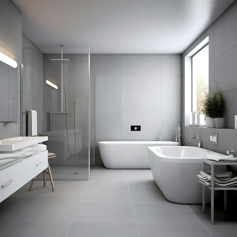
Your bathroom is more than just a functional space—it's a place of relaxation and rejuvenation.
Explore Guide →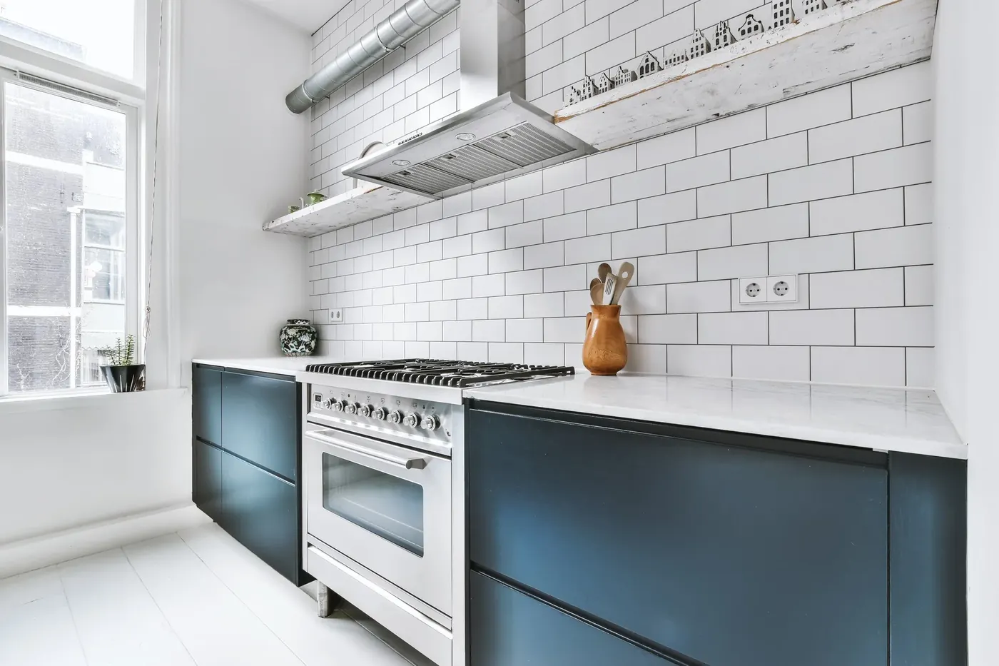
Finding the perfect color for your space can be a challenging yet exciting journey.
Explore Guide →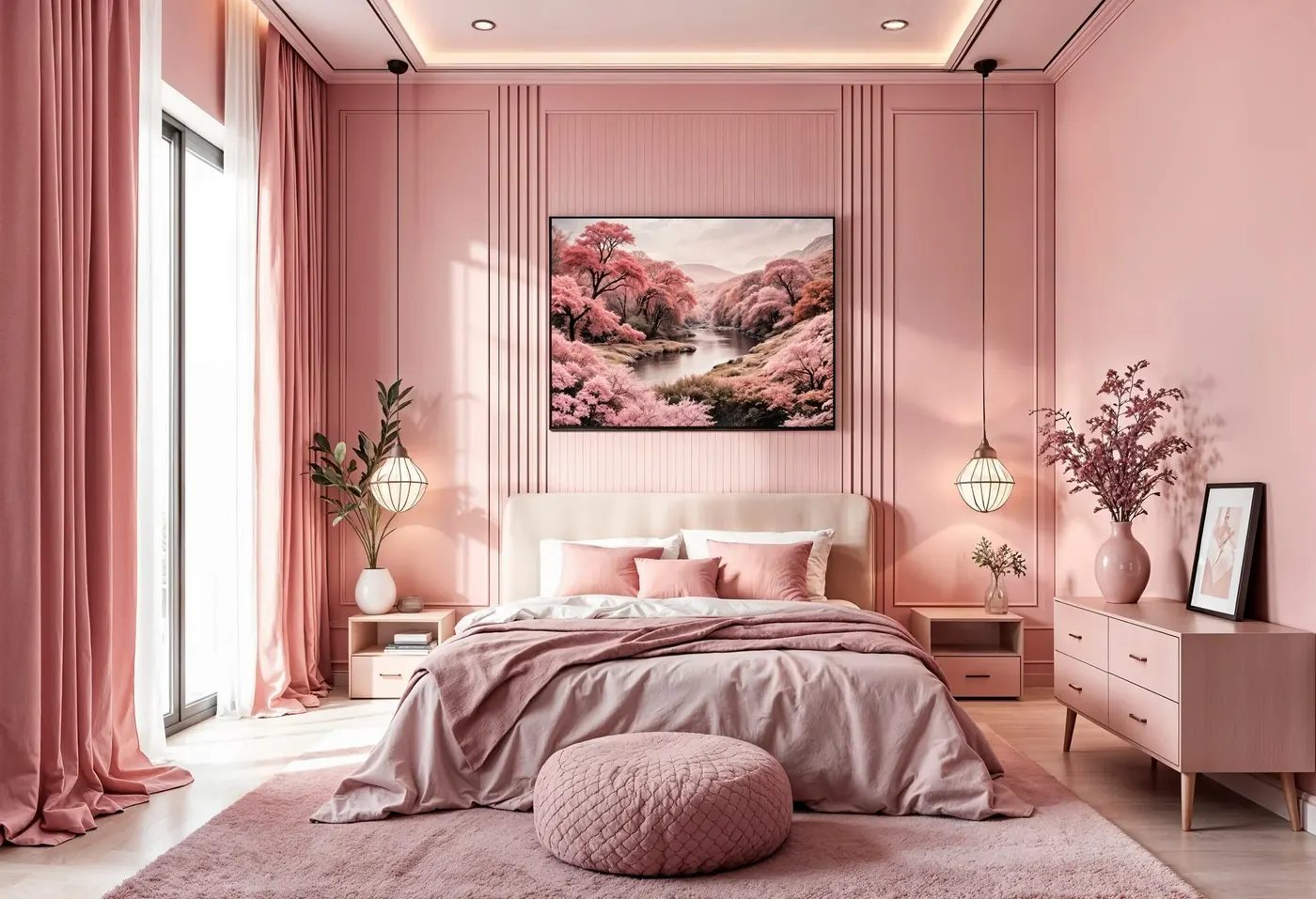
The bedroom should feel like a haven of peace, an embodiment of rest and calm.
Explore Guide →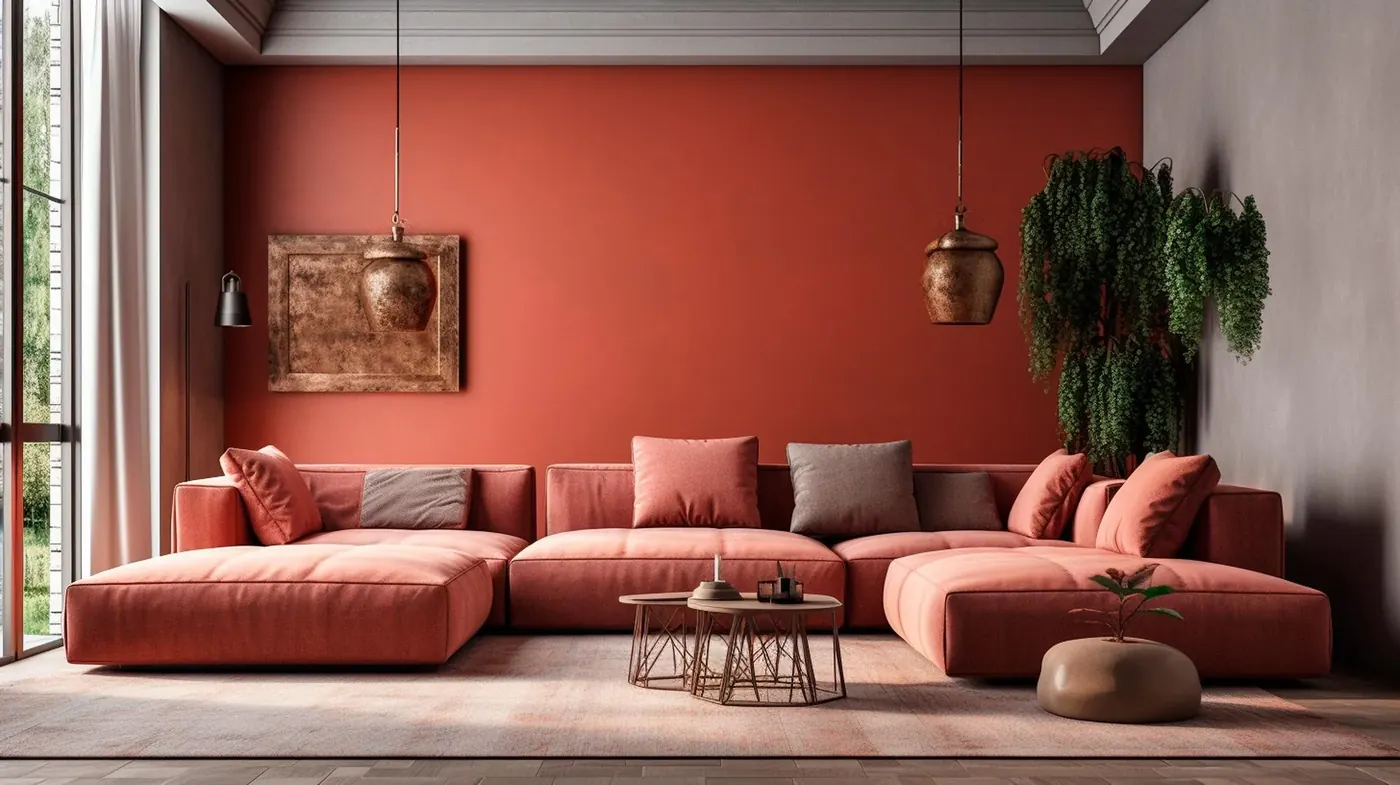
Transform your living room into a masterpiece of comfort and warmth.
Explore Guide →
A focused, clear-headed colour scheme can make working from home feel a lot less like a compromise.
Explore Guide →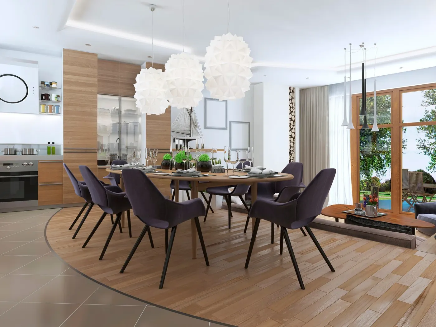
The dining room is where colour gets to be a little braver — built for conversation and good light.
Explore Guide →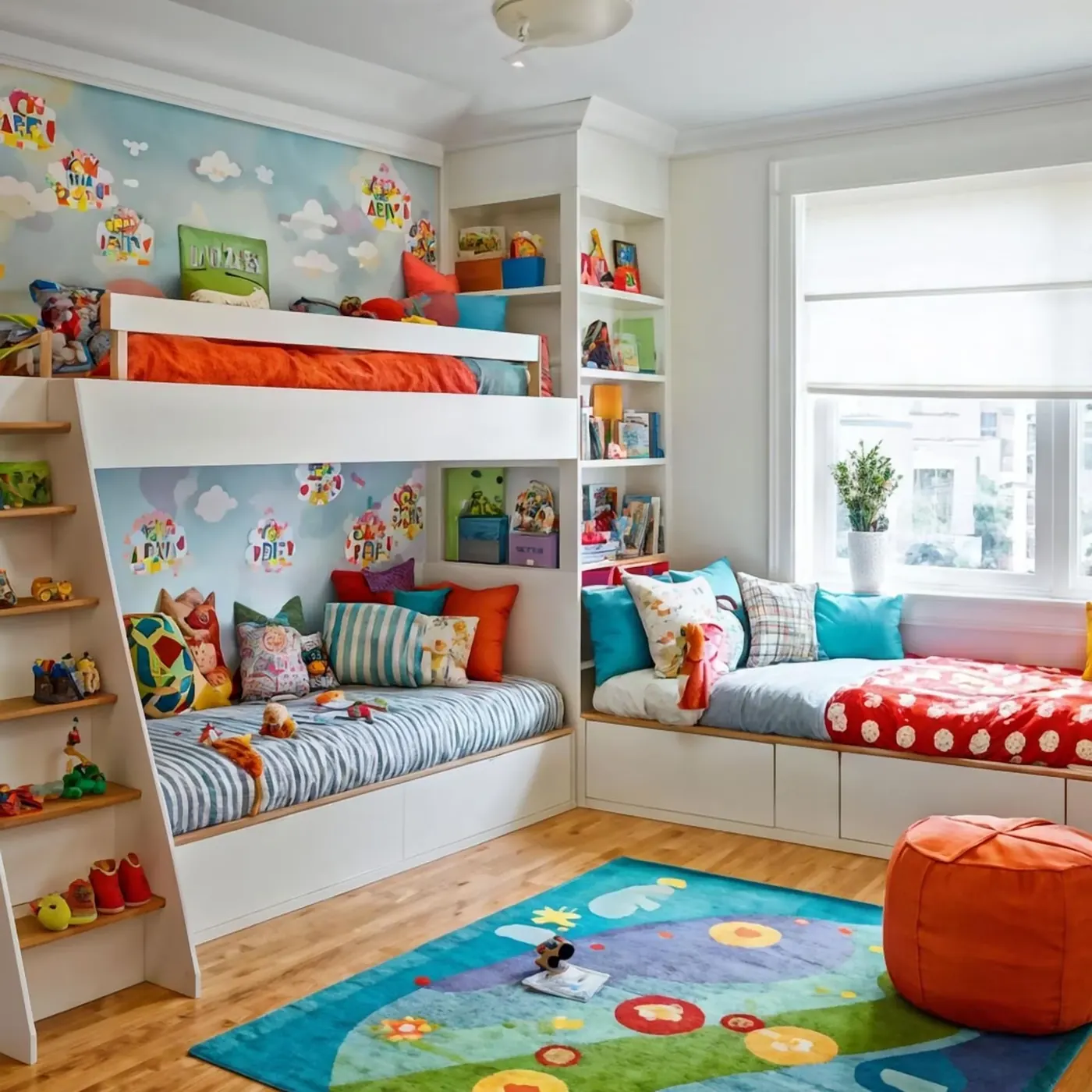
Playful, durable and easy to refresh — a kids' room should grow with them, not against them.
Explore Guide →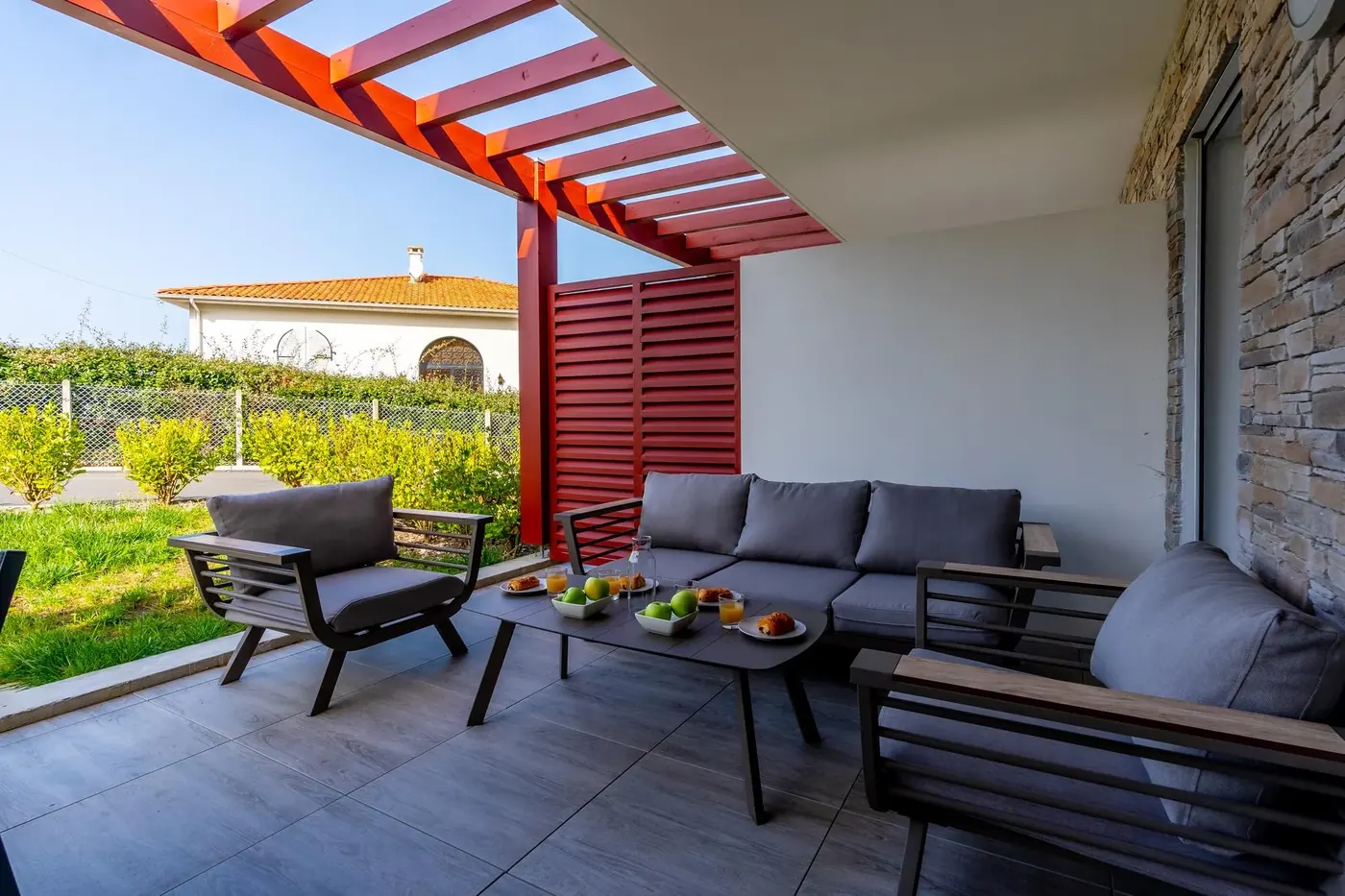
Patios and outdoor walls need colour that can handle sun, rain and everything Kenya's seasons bring.
Explore Guide →Real Results
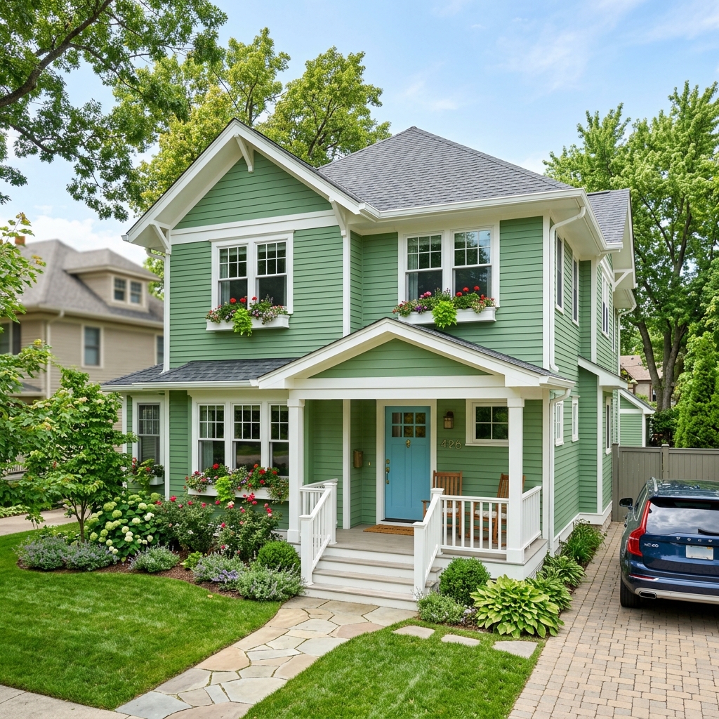
A look at spaces Hermosa Paints has helped bring to life — from private homes to large-scale commercial developments across Kenya.
Loading projects…
What They Say

Our Story
Who We Are
Hermosa Paints is a vibrant and innovative company dedicated to transforming spaces through the art of colour. Established with a vision to provide high-quality paints that inspire creativity and enhance aesthetics, we have grown to become one of Kenya's most trusted paint brands.
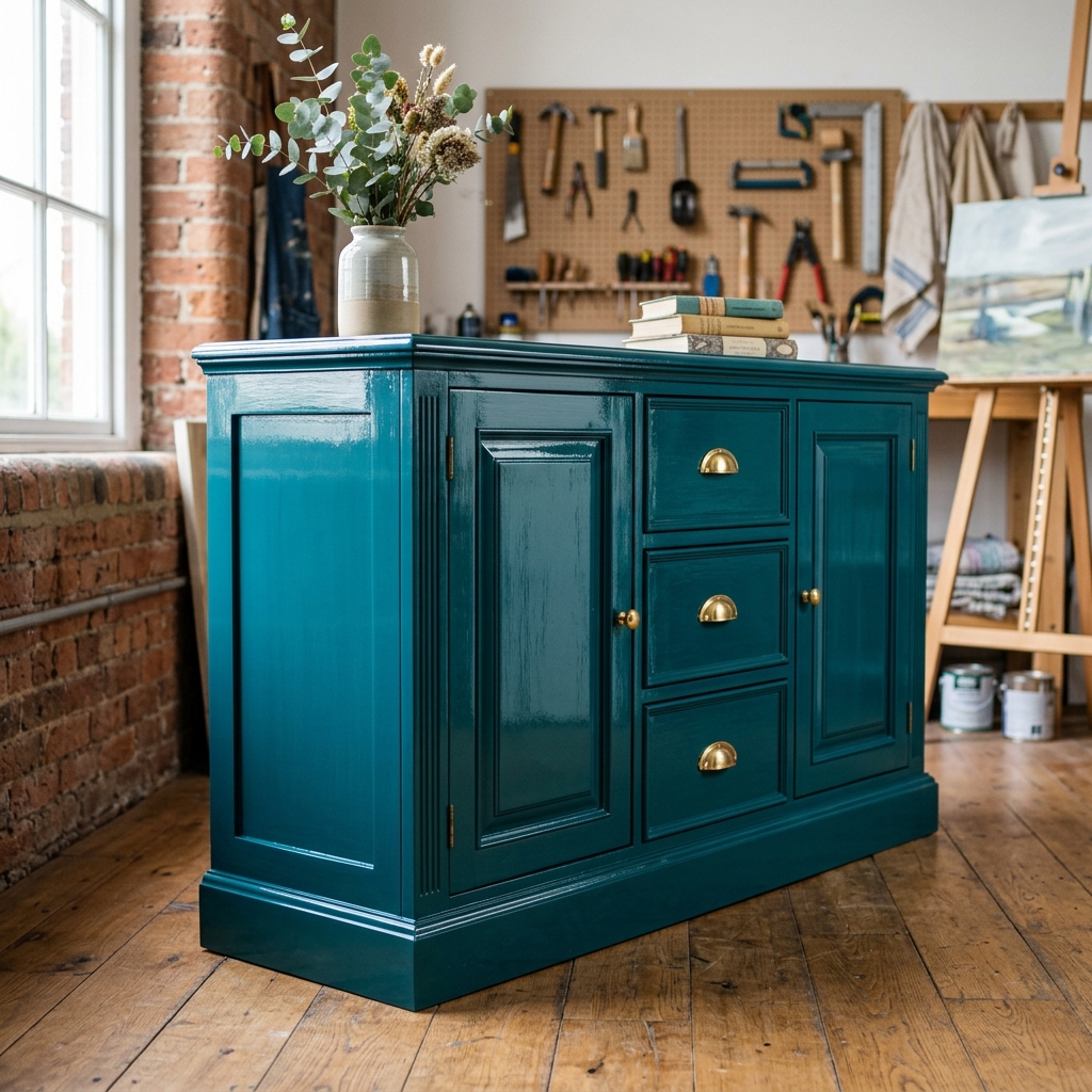
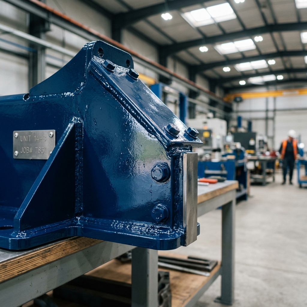
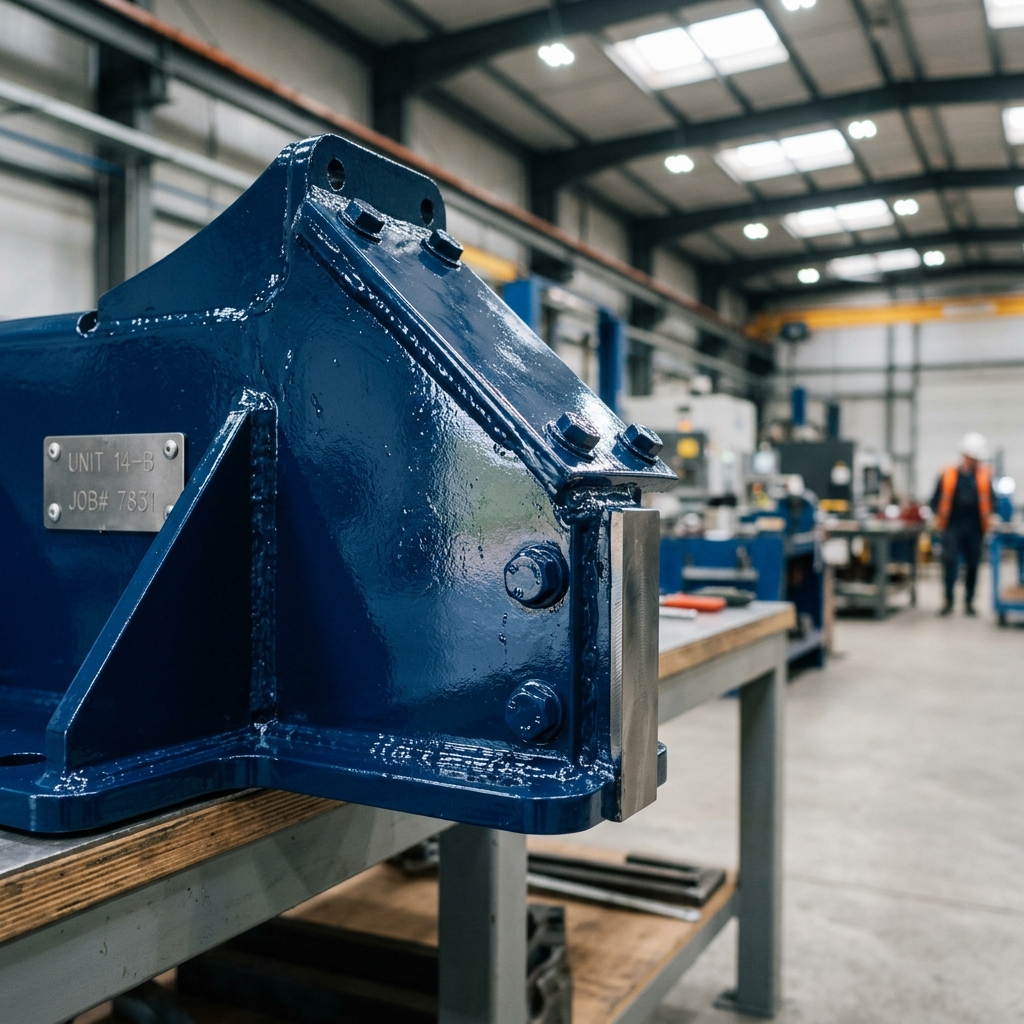
From interior walls to busy highways, from wooden furniture to metal structures — our comprehensive range of coatings is engineered for Kenya's climate, tested for durability, and crafted for beauty.
Our Purpose
To be East Africa's most trusted and innovative paint company — delivering transformative colour solutions that elevate every space, inspire every builder, and brighten every life.
Our Drive
We are committed to manufacturing paints and building solutions that make your projects beautiful, durable, and sustainable — backed by expert guidance, accessible pricing, and a passion for colour.
What Drives Us
We push the boundaries of colour and finish, turning every surface into an opportunity for expression.
Every can of Hermosa paint is formulated to the highest standards, engineered to last through Kenya's toughest conditions.
We actively reduce VOC emissions and invest in eco-friendly formulations that are kind to people and planet.
From local contractors to major developers, we partner with our community to build a more colourful Kenya.
How Far We've Come
Hermosa Paints is founded in Nairobi's Industrial Area with a bold vision and a small but passionate team.
We expand our distribution network to 11+ Depots, bringing Hermosa colours across the country.
We launch a full portfolio spanning interior, exterior, wood, metal, road, floor, roof, thinners and specialty finishes.
With 150000+ Painters, 10000+ colour palettes and a growing team, Hermosa continues to unleash colours and brighten lives across East Africa.
Recognised for Excellence
Over the years our commitment to quality, innovation and sustainable manufacturing has been recognised by industry bodies and regulators across Kenya.
Ready to Transform Your Space?
Get In Touch
Highport Properties,
Road C, Industrial Area
P.O. Box 78895-00507
Nairobi, Kenya
Drop Us a Line
Nationwide Reach
Hermosa Paints is stocked and delivered from depots strategically placed across Kenya, so wherever your next project is, quality paint is never far away.
Join Our Team
We're always looking for driven, creative people to help us bring colour to homes and businesses across Kenya.
Join Our Team
We're always looking for driven, creative people to help us bring colour to homes and businesses across Kenya. Browse our current openings below and apply directly — no account needed.
From the walls of your home to the roads of your city — explore Hermosa's complete range of paints, coatings and finishing systems.

Warm and inviting classic elegance. Rich, buttery tones that create a timeless atmosphere.
HERMOSA PAINTS
The Basics
How hue, harmony and balance turn a bare wall into a finished space — and how we group the Hermosa palette to make picking easier.
Every colour on the wheel sits in relation to every other colour. Pick two that sit close together and you get harmony. Pick two from opposite sides and you get contrast. Pick one to lead and two to support, and you get balance. These three moves — Iconic Family, Dynamic Duo and Hero — cover almost every scheme we build with clients. Pick one below to go deeper.
The 60-30-10 Rule
Neighbouring hues on the colour wheel, split 60% dominant, 30% secondary, and 10% accent for a cohesive, easy-on-the-eye scheme.
Analogous colours sit next to each other on the wheel — think Blues drifting into Greens, or Creams warming into Yellows. Because they share an underlying hue, they never fight for attention. The classic split is 60% dominant colour as the base that anchors the room (usually the walls), 30% secondary colour to support it and add contrast (furniture, a feature wall, soft furnishings), and 10% accent used sparingly to draw the eye (trim, decor, a single bold detail). This is the safest route to a room that feels calm, cohesive and unmistakably "put together," and it's why we group so much of our palette into families rather than one-off shades.
See It Applied
 Living Room
 Bedroom
 Dining Room
The 70-30 Rule
Two colours from opposite sides of the wheel, split 70-30 (or 80-20) so one clearly leads and the other supports.
Complementary colours sit directly across from each other on the wheel — Blues against Yellows, or Greens against Pinks. Placed side by side, each colour makes the other look more saturated and alive. It's a high-energy pairing, best used with a clear lead: one colour taking around 70% of the space (walls, dominant surfaces) with the other filling the remaining 30% (an accent wall, door, or trim). For an even bolder contrast, push it to 80-20. Either way, avoid a 50/50 split — it reads as indecisive rather than dynamic.
See It Applied
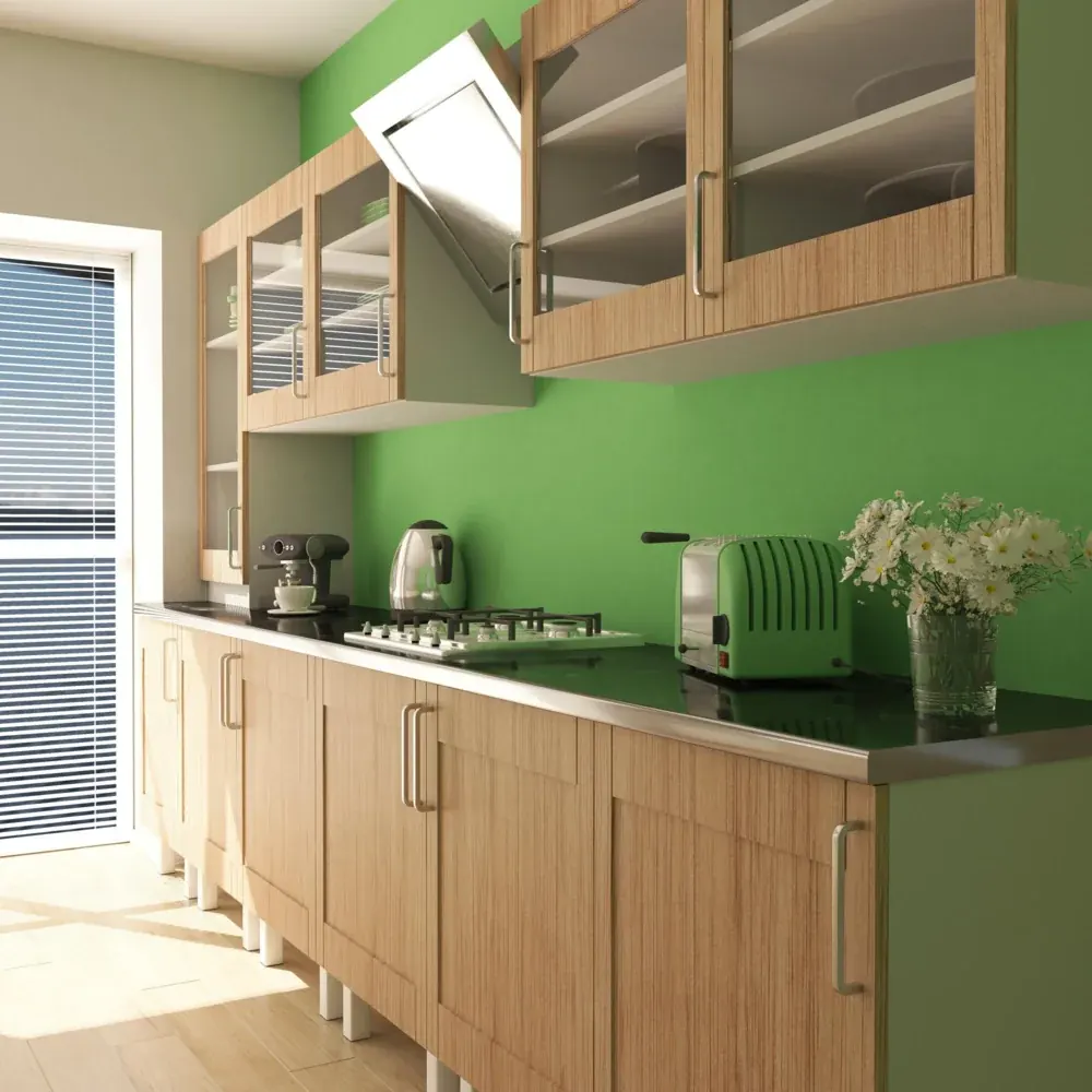 Kitchen
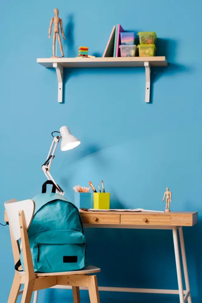 Kids Room
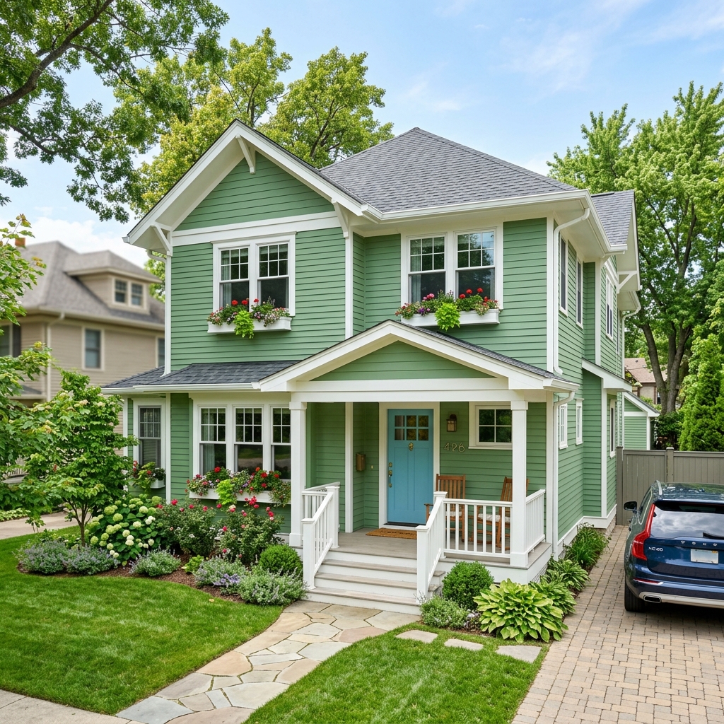
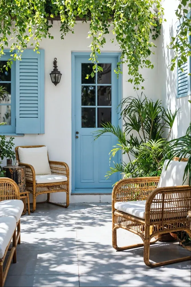 Exterior
The 90-100% Rule
One colour dominates almost everything, with white, black or grey used only for text and spacing.
The Hero approach goes further than a lead colour — it's effectively 90-100% one shade, covering walls, trim and often furnishings, with white, black or grey stepping in only where needed for text and breathing room. There's no second or third colour competing for attention. It's the boldest of the three approaches, and the one that makes the strongest statement — best suited to a single standout room rather than a whole house.
See It Applied
 Home Office
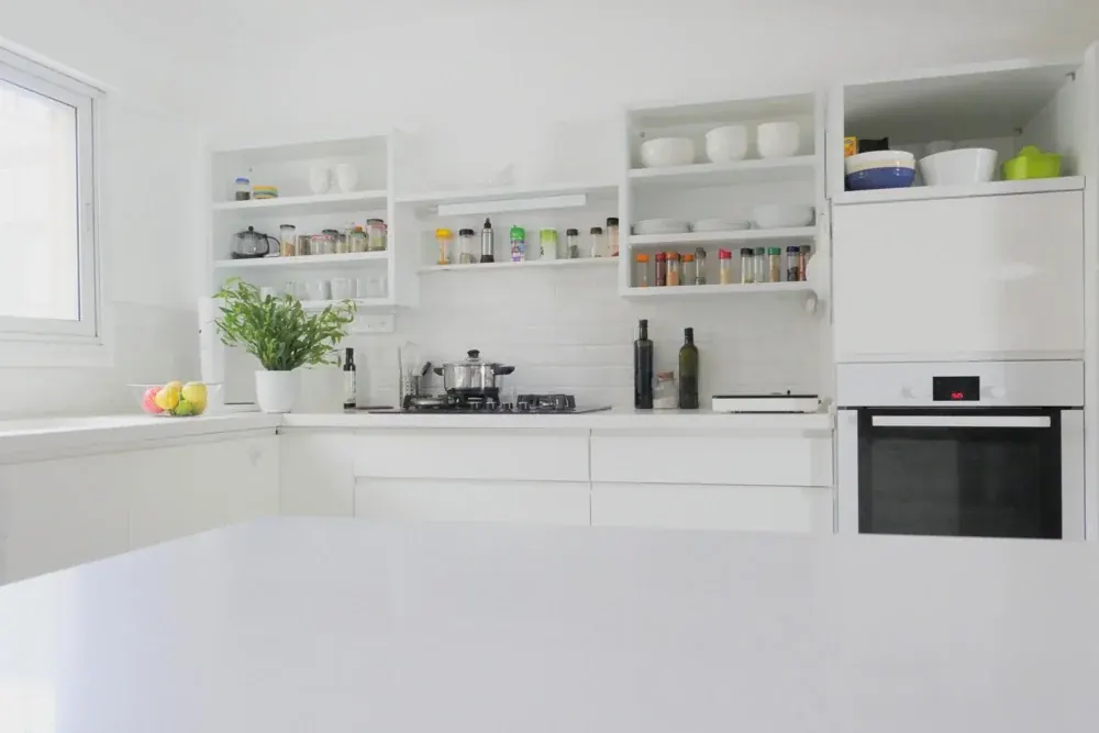 Statement Kitchen
 Show Homes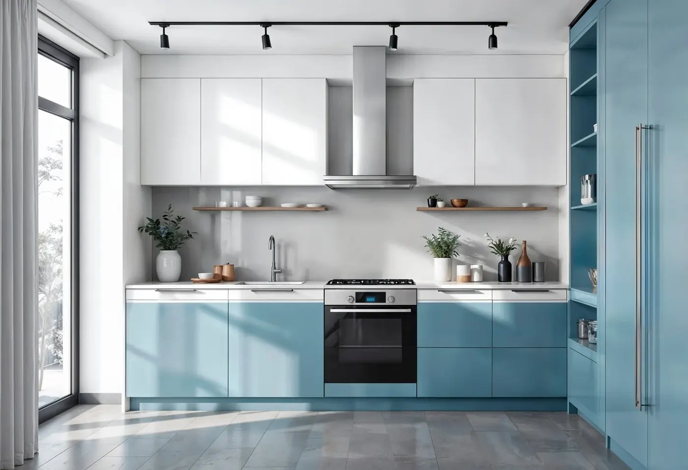
Kitchens see grease, heat and constant cleaning, so durability is just as important as colour choice. Here's how to plan a kitchen repaint that looks sharp and holds up to everyday cooking life.
Pick a wipeable, grease-resistant finish — gloss or satin emulsions clean far more easily than flat matte paints near hobs and counters.
Warm, appetising tones (terracotta, mustard, cream) work well with natural materials like wood and stone.
Tape off and protect appliances, extractor hoods and tiling before you start; grease film can stop new paint from bonding properly.
Use a stain-blocking primer over any smoke or oil marks so they don't bleed through your new topcoat.